


A high-converting service page states the outcome a buyer gets, backs it with trust signals, and gives a single clear path to contact, all above the fold. The immediate fix for most pages: simplify the call-to-action and form near the top, or add a sticky contact option. We’ve built pages around this standard, and the pattern holds up against research from Baymard Institute and Nielsen Norman Group. For a sensitive service sector, see our funeral home website guide.
TL;DR:
- Simplify or add sticky contact options near the top of the page to prevent early abandonment and increase lead conversions.
- Use clear, outcome-focused headlines combined with trust signals and a straightforward process explanation to answer buyer doubts quickly.
- Keep inquiry forms to three fields, prioritize tested call-to-action placement, and offer alternative contact methods like phone or chat.
- Prioritize fixing above-the-fold CTAs and forms before redesigning visual elements, ensuring easy self-qualification and accessibility.
- Adopt proven layout patterns such as hero sections with price ranges, tiered packages, or explainer videos to suit your service type and target audience.
Table of Contents
- Examples and design patterns worth copying
- The essential elements every service page needs
- Writing copy that gets the click
- Layout and imagery choices that hold up on any screen
- Designing forms and CTAs that don’t lose leads
- What to measure and three tests worth running first
- Showing proof without overselling it
- What small service businesses should fix first
- Get a service page built to convert, not just to look good
- FAQ
- Sources
Examples and design patterns worth copying
Service pages that convert tend to follow a handful of repeatable structures rather than one perfect template. Borrowing a pattern that fits your business saves time and avoids guesswork.
- Lead-gen hero with price ranges: A bold headline, a price range or “starting at” line, and a short form sit above the fold; best for contractors and home services where buyers want a quick gut check on cost.
- Package cards: Three tiers (basic, standard, premium) laid out side by side, each with deliverables and a CTA button; works well for agencies, consultants, and recurring service plans.
- Long-form credibility page: Headline, problem statement, proof section, process explanation, and FAQ stacked in sequence; suited to higher-ticket services like legal, medical, or financial consulting where buyers need more convincing before they call.
- Explainer plus scheduling widget: A short video or illustration next to an embedded calendar booking tool; effective for service providers who want to skip the form entirely and get a call on the books.
For small or local businesses, adapt these patterns rather than copying them outright. Swap stock photography for real job site or storefront photos, keep package tiers to two or three options to avoid overwhelming a mobile screen, and make sure the budget for design doesn’t outpace the budget for getting found in local search. Our lead generation landing page examples break down several of these hero and CTA layouts in more detail.
The essential elements every service page needs
Every service page, regardless of industry, should answer the same set of buyer questions in roughly this order.
- Headline and value pitch: State the outcome plus a qualifier, such as the audience or timeframe, so visitors know in five seconds whether they’re in the right place.
- Service offer with brief deliverables: Describe what’s included in plain terms, not a long bullet dump of every feature.
- Trust signals: Testimonials, certifications, and specific case outcomes placed near the CTA, not buried at the bottom.
- Process or what-to-expect section: Three simple steps (consult, plan, deliver) that remove uncertainty about what happens after someone reaches out.
- Clear CTA and contact path: One primary action, repeated at logical points, plus a phone number or chat option for visitors who don’t want to fill out a form.
- Pricing guidance: A range, a package structure, or a “starting at” figure so visitors can self-qualify before contacting you.
Pro Tip: Put your strongest testimonial or case result directly next to your CTA button, not in a separate section further down the page.
Writing copy that gets the click
The words on a service page carry as much weight as the layout. A headline formula that works across most service categories: outcome plus audience or constraint, such as “More booked jobs in 30 days for local contractors.” The subhead that follows should reinforce why the claim is credible and name who it’s for, so skimmers can self-select in or out within a sentence.
Below the fold, the choice between benefit bullets and feature bullets matters more than most pages treat it.
- Benefit bullets describe what the buyer gets (“fewer missed calls, more booked estimates”), and they consistently outperform feature bullets in service copy.
- Feature bullets describe what’s included (“24/7 answering service”), useful as supporting detail but weak as a headline hook.
- Pricing microcopy works best framed around value (“most projects run $2,000 to $5,000”) rather than a bare number with no context.
- Guarantee language should be specific and limited, never absolute, since vague promises read as filler rather than reassurance.
Test value-based messaging against price-first messaging on different traffic sources: paid search visitors often respond to price-first copy, while organic and referral visitors tend to respond better to the outcome-led version.
Layout and imagery choices that hold up on any screen
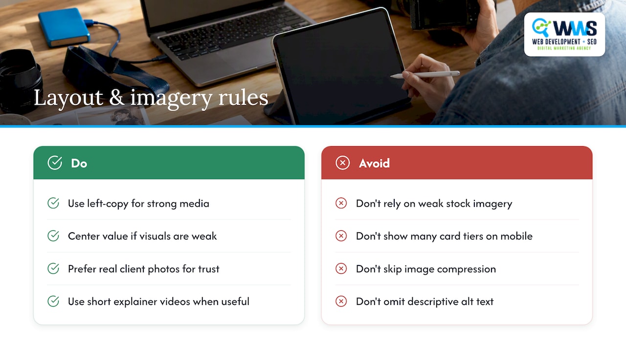
Hero composition sets the tone before a visitor reads a word. A left-copy, right-media layout works well when you have strong photography or a short video; a centered value proposition works better when you don’t, since it avoids drawing attention to weak visuals. Real client photography generally outperforms stock imagery for trust, but a short explainer video can do more work than either when the service itself is hard to visualize.
Carded package layouts stack cleanly on mobile when limited to two or three tiers; long-form credibility pages need clear section breaks so the scroll doesn’t feel endless. Compress images before upload, lazy-load anything below the fold, and write descriptive alt text for every photo, both for accessibility and for how search engines read the page, a point Google’s own guidance on helpful content reinforces directly.
Designing forms and CTAs that don’t lose leads
The single biggest lever on a service page’s form is field count. Baymard Institute’s research on checkout flows found that the number of fields a visitor has to think about predicts abandonment more reliably than the number of steps in the process, which means a three-field inquiry form will usually outperform a ten-field one even if the ten-field version feels more thorough to the business owner.
Baymard Institute’s checkout research shows that reducing visible form fields and adding an immediate alternate route lowers drop-off and increases qualified leads.
- Ask only what you need to start the conversation: name, phone or email, and one qualifying question.
- Use a scheduling widget like Calendly or Acuity when you want to skip the form and get a call booked directly.
- Place CTAs in the hero, as a sticky bar on scroll, and inline near proof sections, not just once at the bottom.
- Test CTA copy variations (“Get a Free Quote” versus “Check Availability”) against each other on the same traffic.
- Always give visitors who dislike forms an alternate route: a visible phone number or live chat option.
What to measure and three tests worth running first
Three metrics matter more than the rest: contact rate (visitors who reach out divided by total visitors), form completion rate, and phone calls tracked through a call-tracking number. Assisted conversions, meaning visits that didn’t convert immediately but led to a later contact, round out the picture for services with longer decision cycles.
- Headline A/B test: Run an outcome-led headline against a feature-led one and measure contact rate, not just time on page.
- Form length reduction: Cut your form from six or more fields down to three and compare completion rate over at least two to four weeks.
- CTA placement test: Compare a sticky CTA bar against inline-only buttons to see which drives more clicks per session.
Prioritize whichever test touches the most traffic with the least development effort, and only roll a winning variant out sitewide once it holds up across at least a few weeks of data, an approach consistent with Baymard’s guidance on prioritizing UX fixes by impact and effort.
Showing proof without overselling it
Credentials work best placed near the CTA, not buried in an “About Us” page. A Google and Meta Partner badge, a certification list, or a client count all belong in the hero or directly beside the first contact form, where a skeptical visitor is deciding whether to trust you.
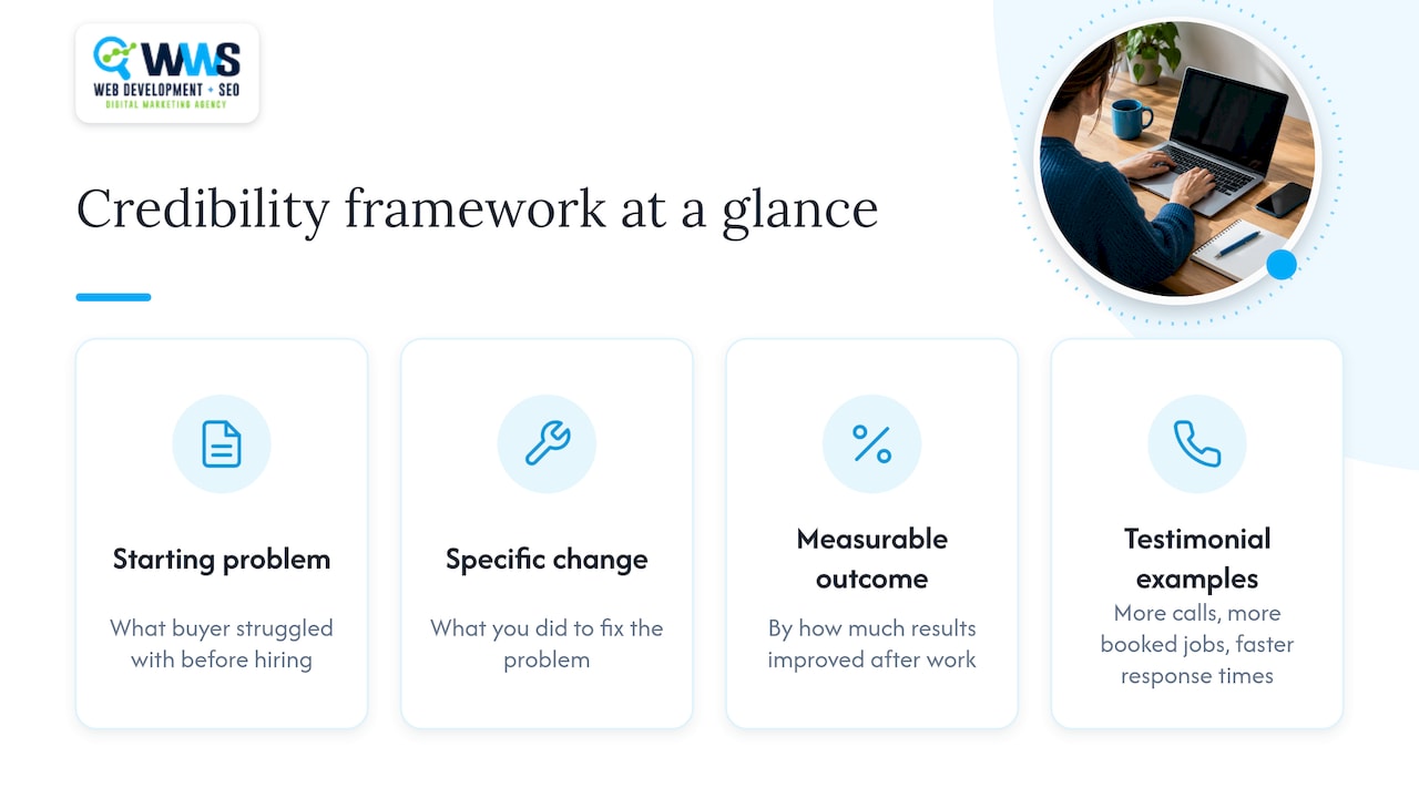
A short case study answers the objections a buyer is already thinking: what was the starting problem, what changed, and by how much. Testimonials work the same way: ask clients to name a specific result (more calls, more booked jobs, faster response times) rather than general praise, since specific outcomes do more to resolve doubt than enthusiasm does.
What small service businesses should fix first
Most small business owners redesign the wrong thing first. Before touching colors or photos, fix the above-the-fold CTA and form, since that’s where contacts are won or lost. Spend the next round of effort on copy and proof that answer real buyer doubts, not on adding pages nobody asked for. Once the page is live, turn to service page SEO so the page you just fixed actually gets found.
— Online Marketing Experts
Get a service page built to convert, not just to look good
We handle website design, local SEO, and ongoing optimization entirely in-house, which means the same certified team that writes your copy also builds the page and tracks the results. We’ve applied the patterns above across contractors, restaurants, and service providers throughout the Chicago area.
- Request a free page audit to see where your current service page is losing contacts.
- Get a quote on a full website design rebuild if your page needs more than a tune-up.
- Ask about pairing your new page with local SEO so it actually gets found.
Reach out through our website design page to schedule a free audit or request a quote.
FAQ
What are the four P’s of service design?
Definitions vary across design disciplines, but a common version covers people, process, product, and physical evidence, the elements that shape how a customer experiences a service from start to finish. On a web page, this translates to showing who you are, how the work happens, what’s delivered, and the proof that backs it up.
What should a service page include?
A service page should include an outcome-focused headline, a clear description of what’s delivered, trust signals like testimonials or certifications, a simple process overview, pricing guidance, and a single clear call-to-action. Each element should answer a specific buyer doubt rather than just filling space.
What are the three main components of service design?
Most frameworks for service design converge on three core components: the user’s needs, the process that delivers the service, and the touchpoints where the user interacts with the business. A service page should reflect all three by stating the outcome, explaining the process in simple steps, and making the contact touchpoint easy to find.
What are some good website designs for services?
Strong service page designs tend to follow one of a few patterns: a lead-gen hero with pricing and a short form, carded package tiers, a long-form credibility page for higher-ticket services, or an explainer paired with a scheduling widget. The right choice depends on how much convincing your service typically requires before someone reaches out.
How many form fields should a service inquiry form have?
Keep an inquiry form to three fields when possible: name, contact method, and one qualifying question. Baymard Institute’s research found that the number of fields a visitor has to consider predicts abandonment more strongly than the number of steps in a flow, so shorter forms tend to convert better than longer ones.
Sources
- Checkout Optimization: 5 Ways to Minimize Form Fields in Checkout
- User Experience for Mobile Websites and Applications (NN/g report)