


A good call to action (CTA) tells a visitor exactly what to do next and what they get for doing it. “Get my free roof estimate” works because it names the action and the payoff. “Submit” does not. Below are copy examples grouped by goal and funnel stage, plus the design and placement rules that decide whether anyone clicks. We wrote it for local service businesses, but the principles apply to any site.
TL;DR
- Start with a strong verb, state the outcome, and keep it short. HubSpot’s analysis recommends two to five words and reports that power words can lift conversion by up to 12.7%.
- Avoid “Submit”, “Sign up” and “Learn more”. They describe the mechanic, not the value.
- Match the ask to the visitor’s stage: low commitment for cold visitors, friction removal for people ready to decide.
- Make buttons easy to tap and easy to see. WCAG 2.2 sets a floor of 24 by 24 CSS pixels, and larger is safer on phones.
- For service businesses, the best CTA is often a phone number or a short form, placed where the visitor decides.
Table of Contents
- What a call to action actually does
- The anatomy of a CTA that gets clicked
- Call to action examples by goal
- Weak CTAs and what to write instead
- Match the CTA to the visitor’s stage
- Urgency and scarcity: use them only when real
- Design and placement rules
- Personalize where you can
- How to write and test your own CTA
- Our perspective
- Turn better CTAs into more calls
- FAQ
- Sources
What a call to action actually does
A CTA is any button, link or form that asks the visitor to take a specific next step. It is the bridge between what the visitor wants and what your business needs. Done well, it feels like a natural next step, not a sales pitch.
For a Chicago roofer, the CTA might be “Call now for a same-day inspection”. For a dentist, it might be “Book my cleaning”. For a restaurant, “Order pickup”. The structure is the same: a verb, an object, and often a reason to act now.
Most CTA lists you will find online focus on software and ecommerce. Local service buyers behave differently. They often have an urgent problem (a leak, a broken furnace, a toothache), they compare two or three providers, and they want to talk to a person. That changes which CTA wins.
The anatomy of a CTA that gets clicked
Every strong CTA combines four things.
- A command verb. Get, Book, Call, Schedule, Request, Download, See. HubSpot notes that action verbs add momentum and that the best CTAs lead with one.
- A clear outcome. LogRocket points to the pattern of a command plus the result, such as “Open an account for free”. The visitor knows what happens next.
- A reason to act. A benefit, a guarantee or a deadline that is real.
- Low perceived risk. “Free”, “no obligation”, “takes 2 minutes” answer the unspoken objection.
First person or second person?
Switching from “Get your free template” to “Get my free template” can raise click-through, according to Landing Doctors, because the button speaks from the visitor’s point of view. Test it on your main button. It is one of the cheapest experiments you can run.
Call to action examples by goal
The examples below are copy patterns you can adapt. They are not quotes from any real company’s site. Swap in your own service, city and offer.
Get a quote or estimate
This is the core CTA for contractors, remodelers, HVAC and restoration companies.
- Get my free roof estimate
- Request a kitchen remodel quote
- Get a same-day HVAC quote
- Schedule my free window consultation
The formula: Verb + my + service + free/same-day qualifier. The qualifier removes the fear of commitment.
Call now
On mobile, a tap-to-call button is often the highest-value action on the page.
- Call now: we answer 24/7
- Call for emergency water damage help
- Tap to call a licensed electrician
- Talk to a local expert today
Only say “24/7” or “licensed” if it is true and you can show it. Trust collapses fast when the promise on the button does not match reality.
Book an appointment
Best for dentists, med spas, salons and other appointment-based businesses.
- Book my cleaning
- Reserve my consultation
- Pick a time that works for me
- See open appointments this week
“See open appointments” is softer than “Book now” and suits visitors who are still comparing.
Download or subscribe
Use these when the value is an asset such as a guide or checklist. Landing Doctors advises using this type when the asset itself is the value.
- Download the homeowner’s storm checklist
- Send me the maintenance guide
- Get seasonal tips by email
Never ask for more information than you need. A name and email is plenty for a checklist.
Order or buy
For restaurants and online shops.
- Order pickup
- Start my catering order
- Add to cart: free local delivery
An analysis from ConversionStudio found that ecommerce CTAs mentioning a specific benefit such as free shipping can raise add-to-cart rates by 18% to 26%. The strongest ones pair the action with an objection-killer.
Low-commitment next steps
For cold visitors who are not ready to call.
- See our recent projects
- Watch how it works
- Check if we serve your neighborhood
- Read what customers say
These keep people moving down the page without asking for much.
Weak CTAs and what to write instead
| Weak CTA | Why it underperforms | Stronger version |
|---|---|---|
| Submit | Describes the mechanic, not the value | Send my request |
| Sign up | Vague and sounds like a commitment | Get my free quote |
| Learn more | No clear payoff | See pricing factors for roofing |
| Click here | Says nothing | Check my service area |
| Contact us | Generic and low urgency | Talk to a local expert today |
| Buy now | Pressure without reassurance | Order today, free pickup |
Practitioners cited by Landing Doctors avoid generic phrases like these because they lead to lower conversion than benefit-driven wording. “Contact us” is fine in a navigation menu, but your main on-page buttons should do more work.
Match the CTA to the visitor’s stage
Not everyone arriving on your site is ready to book. A single “Call now” button on every page asks too much of some visitors and too little of others.
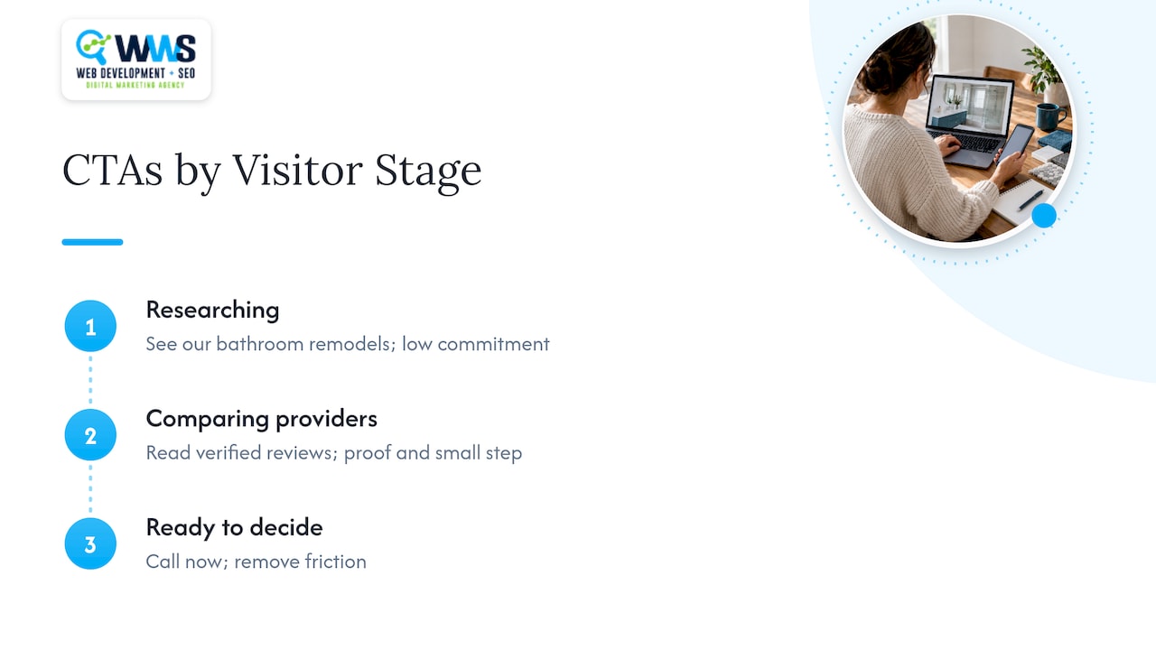
Early stage (just researching). Offer something to read or see: “See our bathroom remodels”, “Get the pricing guide”. Landing Doctors recommends testing low-commitment CTAs for cold visitors.
Mid stage (comparing providers). Offer proof and a small step: “Read verified reviews”, “Check my service area”, “Get a free estimate”.
Ready to decide. Remove friction: “Call now”, “Book my visit”, “Get my quote in 2 minutes”. Add reassurance nearby, such as insurance, response time or a guarantee.
A practical setup for a service page is one primary CTA, one secondary CTA for hesitant visitors, and a persistent phone number on mobile.
Urgency and scarcity: use them only when real
“Claim my spot” and “Book before Friday” can work, but only when the limit is genuine. Landing Doctors warns that fake scarcity is easy for trained users to spot and costs you trust.
Honest urgency for a local business looks like this:
- “Only 6 inspection slots left this week” (if your calendar really says so)
- “Book before the first freeze: furnace tune-ups open now” (a real seasonal reason)
- “Offer ends October 31” (if it actually ends)
If you cannot back the claim up, drop it and lead with the benefit instead.
Design and placement rules
Good copy on a button nobody can see or tap still fails.
Size and spacing
WCAG 2.2 requires pointer targets to be at least 24 by 24 CSS pixels, unless spacing or another exception applies. LogRocket recommends going larger, at least 48 by 48 px, with at least 8 px of space between side-by-side buttons so people do not tap the wrong one. On a phone held in one hand, bigger is kinder.
Contrast and focus
The button should stand out from the page, with readable text on a strong background, and be reachable by keyboard with a visible focus state. Our WCAG checklist for developers walks through the keyboard and screen reader tests.
Placement
- Above the fold: a primary CTA and a phone number in the header.
- After proof: a CTA right after reviews, project photos or a guarantee, when trust is highest.
- End of page: a final CTA with the next step restated.
- Sticky on mobile: a call or quote button that stays visible while scrolling.
We cover how page structure supports this in our guide to service page design fixes and in the walkthrough of lead generation landing pages.
One primary action per screen
Two equal buttons compete. Make one visually dominant and style the other as a text link or outline button.
Keep the form short
The CTA promises something easy, so the form behind it should deliver. Name, phone and a short description are often enough. See why simple contact forms beat complex funnels.
Personalize where you can
HubSpot’s research summary says personalized CTAs, adjusted to behavior or demographics, can convert up to 202% better than generic ones. For a local business, personalization can be simple:
- Show the suburb: “Get my free estimate in Naperville”.
- Show a different CTA to returning visitors: “Pick up where you left off”.
- Change the offer by service page: “Free drain camera inspection” on a plumbing page, not a generic quote button.
Local landing pages are a natural fit. Our article on local landing page design for Chicago shows how city-specific pages can carry city-specific CTAs.
How to write and test your own CTA
- Name the one action you want from this page: call, book, quote or download.
- Write the outcome in the visitor’s words: “Get my quote”, not “Submit request”.
- Add one reassurance: free, no obligation, takes two minutes, or a real guarantee.
- Check the promise is delivered immediately on click. If the button says “Get my checklist”, the checklist should appear or arrive right away.
- Write three variants and change one thing at a time: verb, first versus second person, or reassurance.
- Track calls and form submissions, not just clicks. A button that gets clicks but no calls is not working.
- Let the test run long enough to collect a meaningful number of visits before picking a winner.
The numbers quoted in this article come from third-party marketing sources and vary by industry, traffic and offer. Treat them as reasons to test, not as guaranteed lifts.
Our perspective
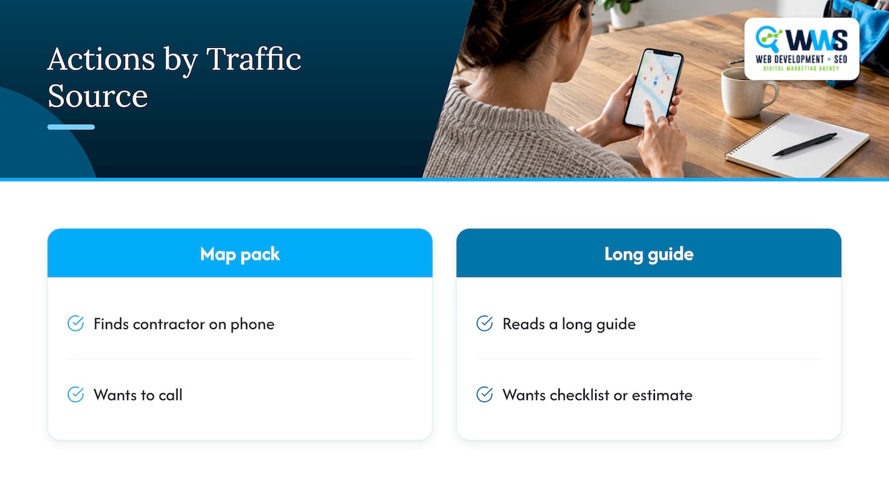
We build websites and run local SEO for service businesses around Chicago, and the CTA problem we see most often is not weak wording. It is a mismatch between where the traffic comes from and what the page asks for. Someone who finds a contractor in the map pack on their phone wants to call. Someone who reads a long guide wants a checklist or an estimate. A site that gives both the same “Contact us” button wastes the visit.
So we treat CTAs as part of the page’s architecture. The design team decides hierarchy and size, the developers make buttons fast and accessible, and the SEO team makes sure each page matches the search intent that brought the visitor there. Because all of that happens in-house at our Des Plaines office, nobody has to hand off a button design to a different vendor. Our advice: pick one primary action per page, make it a phone call or a short form for urgent services, back it with real proof, and measure the calls it produces.
— Online Marketing Experts
Turn better CTAs into more calls
If your site gets traffic but few calls, the fix is usually a mix of copy, layout, speed and local search visibility. We are an official Google and Meta Partner with over 200 client partnerships, and we handle design, development and SEO under one roof. Explore our website design and local SEO services, or start from the WWS homepage to talk with our team. For more tactics, read our seven proven ways to increase website leads.
FAQ
What is an example of a good call to action?
“Get my free roof estimate” is a good one. It starts with a verb, states what the visitor gets, and removes risk with the word “free”. It is also short enough to read at a glance on a phone.
How long should a CTA button be?
Aim for two to five words, as HubSpot suggests. Go slightly longer only when the extra words add a real benefit, such as “Order today, free pickup”.
Should I use first person on buttons like “Get my quote”?
It is worth testing. Landing Doctors reports that first-person wording can improve click-through because it reads from the visitor’s perspective. Results vary by audience, so run an A/B test rather than assuming.
How many CTAs should a page have?
One primary action, repeated at logical points such as the header, after proof and at the end of the page. A secondary option for less ready visitors is fine, but it should look quieter than the primary button.
What is the best CTA for a local service business?
Usually a click-to-call button paired with a short quote or booking form. Urgent services such as plumbing, HVAC and water damage lean on calling. Planned projects such as remodeling lean on estimates and consultations. Test both on your own traffic.
Sources
- 49 Call-to-Action Examples You Can’t Help But Click, HubSpot
- 47 High-Converting CTA Button Copy Examples, Landing Doctors
- Designing CTA buttons: Actionable best practices, LogRocket Blog
- 50 Call to Action Examples That Convert, ConversionStudio
- Web Content Accessibility Guidelines (WCAG) 2.2, W3C