


Mobile Friendly Dental Website Design for Modern Practices
Discover how a mobile friendly dental website boosts patient bookings, local SEO, and trust—expert design tips from WWS Chicago.
 By WWS Team
Updated
8 min read
In this article7 sections
- How to Build a Mobile-Friendly Dental Website That Helps Patients Book
- Why a Mobile Friendly Dental Website Is Critical for Modern Practice Growth
- Architectural Approaches: Responsive vs. Adaptive Mobile Design
- Essential Features of a High-Performing Practice Site
- Frequently Asked Questions About Mobile Dental Web Design
- Conclusion
- A dental website project in Des Plaines
How to Build a Mobile-Friendly Dental Website That Helps Patients Book
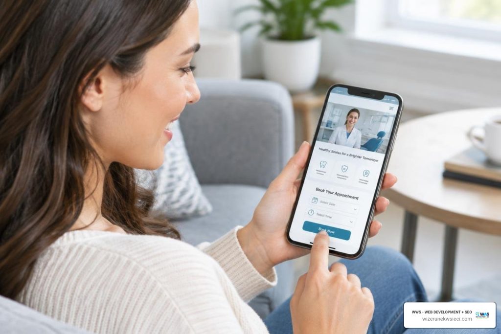
Start with a responsive design that fits any screen. Put your phone number, location, services, and booking button where patients can find them fast. Keep pages quick to load, make buttons easy to tap, and test the full booking process on a real phone. If patients must zoom, wait, or hunt for a way to contact you, fix that before adding more features.
A patient’s search may start on a phone and end with an appointment request. Your site should make each step feel simple, from checking reviews and insurance to choosing a time.
I’m Tomasz Lasota, founder of Wizerunek w Sieci / WWS – Web Development + SEO. For over 22 years, I’ve helped businesses improve their websites and search visibility; here, I’ll show you how to plan a mobile friendly dental website around what patients need.
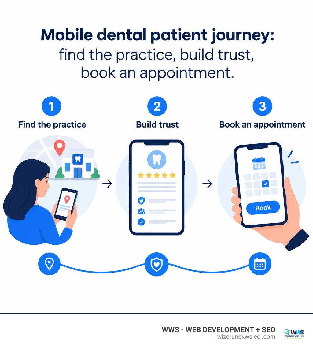
Mobile friendly dental website basics:
Why a Mobile Friendly Dental Website Is Critical for Modern Practice Growth
Over half of all global internet traffic originates from handheld devices, and more than 92% of internet users regularly navigate web pages using smartphones. For healthcare practices across the Chicago metropolitan area—from Des Plaines and Park Ridge to Arlington Heights, Naperville, and Schaumburg—your mobile presence is often the front door of your clinic.
When someone experiences sudden tooth pain or looks for a family dentist while commuting on the Metra, they do not wait until they get home to open a desktop computer. They pull out their phone.

If your website forces visitors to pinch, zoom, or wait through sluggish load times, they leave. Research shows that 50% of people will use a business less often if its website is not mobile-friendly, even if they like the business itself. Conversely, 74% of visitors are more likely to return to a mobile-friendly site, and 67% are more likely to book a service. Implementing modern conversion rate optimization strategies ensures these mobile visitors seamlessly transform into scheduled patients.
Shifting Patient Search Behaviors and Mobile-First Indexing
Google evaluates and indexes websites almost exclusively from the perspective of a mobile smartphone browser. This framework, known as mobile-first indexing, means that if your practice site performs poorly on mobile, your overall organic rankings drop—even for desktop searches.
Local visibility relies directly on mobile readiness. When patients search for terms like “emergency dentist near me” or “Invisalign in Cook County,” search algorithms evaluate your site’s mobile load speed, structured data, and touch-friendly layout. Combining these technical elements with specialized dentist SEO strategies helps local practices climb into competitive local map packs and organic search results.
Overcoming Phone Anxiety with Instant Digital Touchpoints
Patient communication preferences have changed dramatically:
- Online Scheduling Preference: 68% of patients prefer booking their appointments online rather than calling front desks directly.
- Immediate Answers: Prospective patients want to verify insurance coverage quickly (such as checking in-network status with Delta Dental of Illinois | Dental and Vision Insurance) without waiting on hold.
- Emergency Access: Patients dealing with urgent dental issues need immediate contact information and straightforward directions.
Adding clear banners for new patient specials and upfront pricing can increase new patient call volume by up to 40%. A phone-optimized site removes friction for busy parents and working professionals who prefer tap-to-schedule workflows over phone calls during business hours.
Architectural Approaches: Responsive vs. Adaptive Mobile Design
Choosing the right technical foundation is the first major decision when engineering a clinic website. The two primary methods for delivering smartphone-optimized layouts are responsive web design and adaptive web design.
Key Differences in Performance, Maintenance, and Scalability
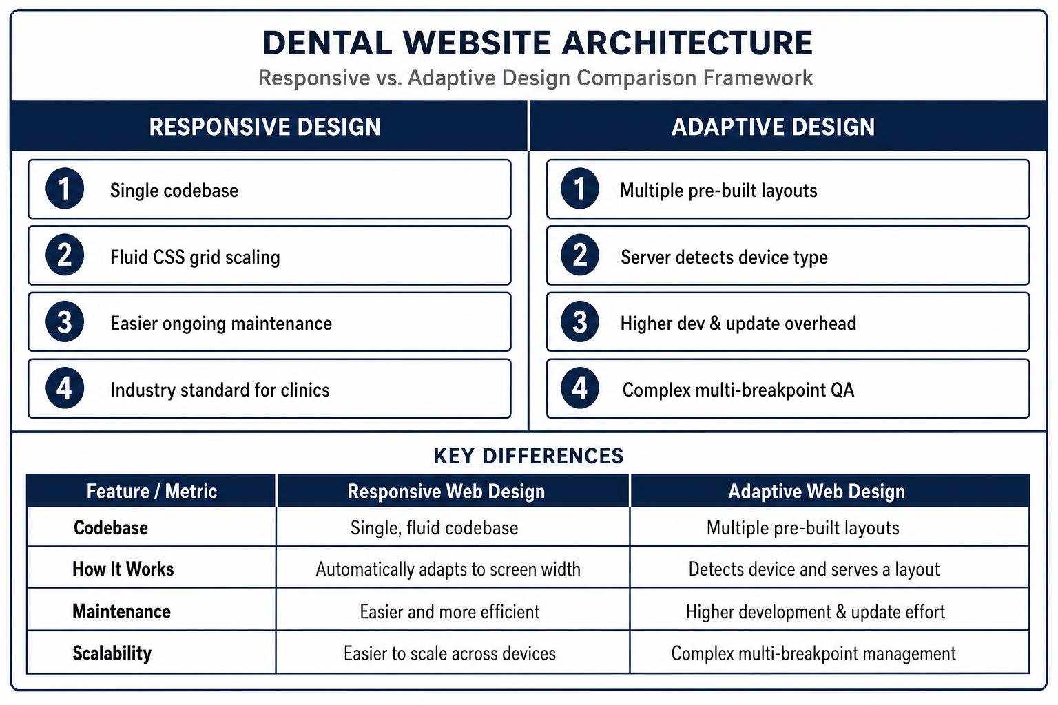
Responsive web design uses a single, fluid codebase that automatically stretches or reflows content based on the visitor’s screen width. Adaptive web design, by contrast, detects the specific device and serves a distinct, pre-built static layout tailored to that screen size.
| Feature / Metric | Responsive Web Design | Adaptive Web Design |
|---|---|---|
| Codebase | Single codebase for all devices | Multiple templates for specific screen sizes |
| Maintenance Overhead | Low; content updates happen once across all views | High; updates must be tested across multiple templates |
| Development Cost | Predictable and cost-effective | Higher initial setup and ongoing engineering costs |
| SEO Uniformity | Preserves unified URLs and clean HTML for Google crawlers | Requires careful setup to prevent canonical/indexing conflicts |
| Best Suited For | Solo practices, dental groups, and multi-location clinics | Complex enterprise portals with unique device features |
For the vast majority of dental practices in Illinois and nationwide, responsive design is the ideal choice. It eliminates the administrative burden of maintaining separate platforms while delivering fast, reliable performance across iPhones, Androids, and tablets.
Optimizing for Core Web Vitals and Page Speed
A beautiful site that loads slowly will lose patients before they ever read your headline. Search engines measure technical performance through Core Web Vitals, focusing on three specific user-experience metrics:
- Largest Contentful Paint (LCP): Measures perceived loading speed. Your main hero image and value proposition should render in under 2.5 seconds on mobile networks.
- Interaction to Next Paint (INP): Measures interface responsiveness. Buttons, menus, and form fields must respond immediately when tapped.
- Cumulative Layout Shift (CLS): Measures visual stability. Page elements should never shift unexpectedly while loading, which prevents frustrating mis-taps.
Techniques such as asset minification, next-gen image compression (WebP/AVIF), server-level caching, and optimizing Core Web Vitals keep bounce rates low and protect your search visibility.
Essential Features of a High-Performing Practice Site
Converting mobile traffic into scheduled appointments requires intentional design choices that accommodate one-handed phone use.
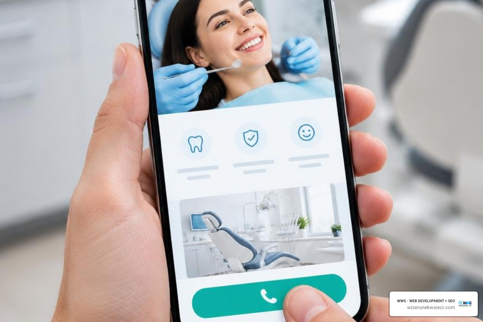
High-converting mobile healthcare websites share several key design elements:
- Sticky Emergency & Call Buttons: A fixed contact bar at the bottom or top of the mobile viewport allows patients to tap-to-call or schedule from anywhere on the page.
- Generous Tap Targets: Buttons, phone links, and menu items should measure at least 48×48 pixels with comfortable spacing to prevent accidental clicks.
- Focused Navigation: Clean hamburger menus prioritize vital sections—Services, About, Insurance, and Book Online—while keeping sub-pages organized.
- Transparent Service Pages: Dedicated, localized service page design outlines exact procedures, recovery expectations, and payment options for treatments like dental implants, pediatric dentistry, and cosmetic veneers.
Engineering a Mobile Friendly Dental Website for Online Scheduling and Forms
Modern dental patients appreciate paperless intake workflows. Moving away from front-desk clipboards saves time and improves accuracy:
- Interactive Online Scheduling: Direct calendar booking synced with practice management software (such as Dentrix, Eaglesoft, or Open Dental) allows patients to select specific providers, appointment types, and times.
- HIPAA-Compliant Digital Forms: Mobile-optimized registration and medical history forms encrypted with SSL security allow new patients to complete paperwork securely on their phones before their visit, cutting check-in times from 15 minutes down to two minutes.
- Low-Friction Inquiries: For general questions, keep forms brief—asking only for a name, phone number, and preferred visit window—to maximize submission rates.
Building Trust on Mobile Through Authentic Bios and Patient Reviews
Dentistry is deeply personal. Many patients experience dental anxiety and want to know exactly who will be treating them before stepping into an operatory.
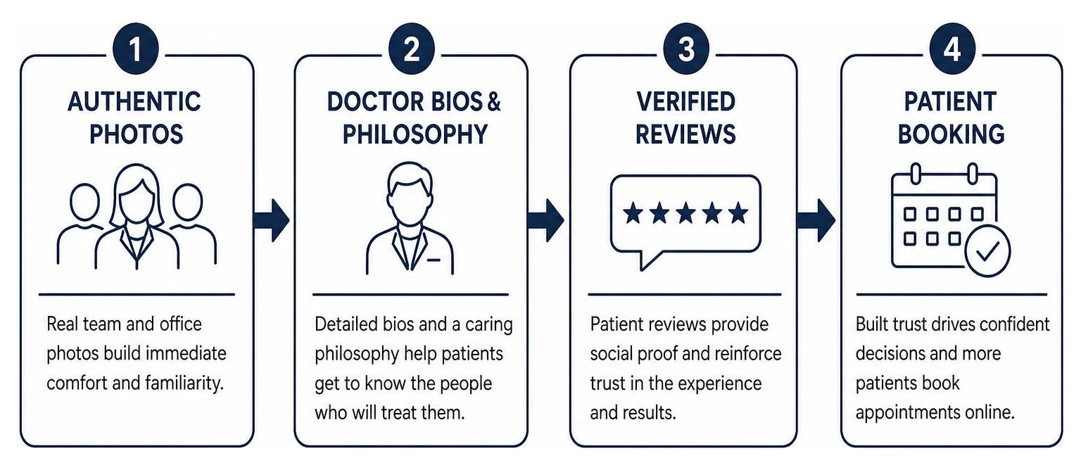
- Authentic Team Photography: Practices with dedicated doctor and hygienist bio pages receive 31% more appointment requests than those relying on stock photography. Authentic photos of your staff and modern operatory create immediate comfort.
- Prominent Review Feeds: With 72% of patients consulting online reviews before selecting a dentist, embedding verified patient testimonials directly on mobile landing pages builds strong social proof.
- Anxiety-Reducing Content: Clarifying comfort options—such as sedation techniques, gentle numbing, and private suites—directly addresses patient concerns before they book.
Launching a Mobile Friendly Dental Website with Proper Local SEO and Accessibility
A modern website must be discoverable and usable by every prospective patient in your community.
To dominate local search results, your site needs targeted local SEO tactics and complete Google Business Profile optimization. Your practice’s Name, Address, and Phone number (NAP) must remain perfectly consistent across your site, local directories, and map citations.
On the technical side, adding service page schema markup (Dentist, MedicalBusiness, and FAQPage structured data) helps search engines and AI assistants understand your office hours, accepted insurances, and procedural specialties.
Finally, ensure your site follows a comprehensive website accessibility checklist aligning with WCAG 2.1 standards. High-contrast typography, clear font sizing, screen-reader compatibility, and accessible touch targets ensure older adults and patients with visual impairments can easily navigate your services.
Frequently Asked Questions About Mobile Dental Web Design
How does mobile optimization impact local Google search rankings for dentists?
Mobile optimization is a direct ranking signal for search engines. Because Google uses mobile-first indexing, it evaluates the mobile version of your site to determine its relevance, speed, and usability. If your mobile pages load slowly or exhibit layout shifts, your organic visibility will drop. A responsive, fast-loading site paired with local schema markup helps your clinic secure top placement in local map 3-packs and search results.
Is responsive web design better than developing a dedicated mobile app for a dental practice?
Yes. For the vast majority of private practices and dental groups, a responsive website is far more practical and cost-effective than a custom mobile app. Most patients visit the dentist only twice a year, meaning they rarely download a dedicated app that takes up storage on their phone. A responsive website provides immediate access through any web browser without requiring app store downloads or separate app maintenance budgets.
What factors influence the cost of redesigning a dental website for mobile devices?
Several factors determine overall website redesign cost factors, including:
- Custom responsive interface design versus pre-made frameworks.
- Integration with practice management and HIPAA-compliant scheduling software.
- The volume of customized service pages, location hubs, and blog content.
- Advanced technical search optimization, schema implementation, and accessibility compliance. Working with an experienced digital agency ensures your site is built as a durable, long-term asset that reliably generates patient leads.
Conclusion
Your website is the central hub of your practice’s marketing. As mobile search traffic continues to dominate patient discovery across Chicago, Des Plaines, Cook County, Lake County, and surrounding communities, having a mobile friendly dental website is essential for sustainable practice growth.
At WWS (Wizerunek w Sieci), we bridge the gap between large national marketing agencies and local freelancers. We combine robust development resources and technical search expertise with hands-on, personalized service. Headquartered in Des Plaines, IL, our bilingual team (English & Polish) takes pride in building custom, high-converting web solutions tailored to local clinics and growing dental groups.
Ready to elevate your online presence and turn mobile visitors into loyal patients? Explore our custom website design services or visit wizerunekwsieci.com to schedule your free website audit with our team.
A dental website project in Des Plaines
For a local example, explore our Des Plaines Dental Studio website redesign. The case study includes before-and-after screenshots and explains the service navigation, practice information and appointment options. You can also meet our marketing team in Des Plaines to discuss your own project.
A Des Plaines, IL team helping local service businesses get found, get called and get booked since 2005: local SEO, Google Ads, conversion-focused websites and AI search optimization.
Meet the teamKeep reading
All articles
Small Business Web Page Design 101: From Blank Screen to Beautiful Site
Learn small business web page design from blank screen to launch: mobile-first layouts, conversion tips, SEO, costs, and timelines for 2026.

Small Business App Cost: What to Budget in 2026
What a small business should budget for an app: build, store fees, maintenance at 15-20% a year, and how features change the price, plus how to scope it.

Homepage Design Best Practices for Local Businesses
Homepage design best practices for local service businesses: what to put above the fold, how it differs from a landing page, speed targets and a checklist.