


Homepage Design Best Practices for Local Businesses
Homepage design best practices for local service businesses: what to put above the fold, how it differs from a landing page, speed targets and a checklist.
 By WWS Team
Updated
12 min read

In this article15 sections
- TL;DR
- What a homepage is actually for
- The first screen: what must be visible without scrolling
- Structure the rest of the page in the order a skeptical visitor asks questions
- Navigation and layout rules that hold up
- Speed and stability: the numbers to hit
- Mobile: design for the phone first
- Accessibility is part of the design brief
- Homepage or landing page: which one should do the job?
- Our perspective: the homepage is a routing page for calls
- Want a homepage built around calls?
- Homepage conversion checklist
- FAQ
- Sources
- Recommended
A good homepage tells a visitor three things within a few seconds: what you do, where you do it, and what to do next. Everything else on the page supports those three answers. If you run a roofing company, a dental practice, an HVAC business or a restaurant, the homepage is usually the page people check before they call, so it has to earn that call quickly, on a phone, with a visitor who is comparing you with two other tabs. For a professional-services example, see our accountant website design guide.
This guide covers the practices that matter most: how to decide what belongs on the page, how to lay it out, how to handle speed and accessibility, and when a landing page should do the job instead. It ends with a checklist you can run against your own site today.
TL;DR
- Start with a short list of the top tasks visitors come to do, then give those tasks the most visual weight on the page.
- Put a clear headline, your service area, one primary call to action and a tap-to-call number in the first screen on mobile.
- Aim for “good” Core Web Vitals: LCP of 2.5 seconds or less, INP of 200 milliseconds or less, CLS of 0.1 or less.
- Use the homepage for broad orientation and a landing page for one specific campaign goal. Do not force one to do the other’s job.
- Build for keyboard users and resizable text, and keep mobile content equivalent to desktop content.
What a homepage is actually for
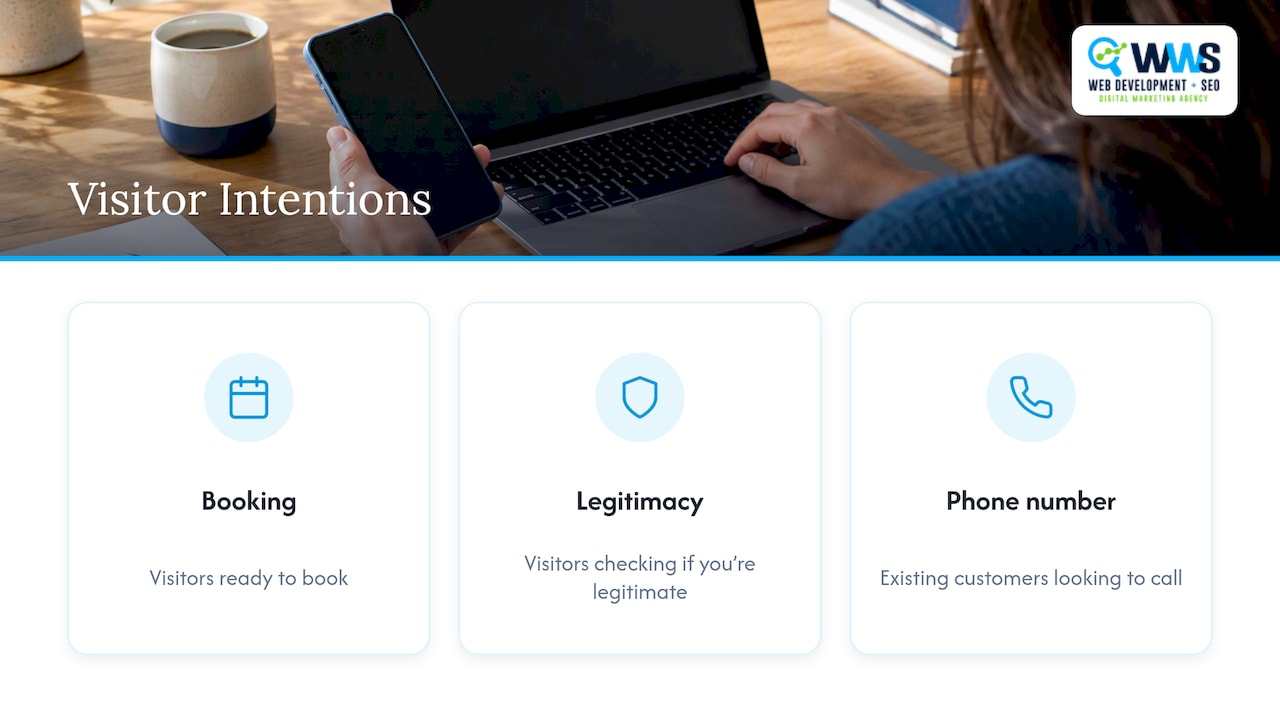
A homepage is the front door of your site. Visitors arrive there from your Google Business Profile, from branded searches, from business cards, from referrals and from people who typed your name after hearing it. They are a mixed audience: some are ready to book, some are checking whether you are legitimate, and some are existing customers looking for a phone number.
That mix is why a homepage needs to do two jobs at once. Usability research from Nielsen Norman Group has long found that homepages must give appropriate emphasis to both branding and high-priority tasks, and that many visitors look straight at a homepage without being able to say what the site is for. For a local business, the fix is plain language. “Roof replacement and storm repair in Naperville and the western suburbs” beats “Excellence in exteriors.”
Start with top tasks, not with sections
Most weak homepages are built from a list of things the owner wants to say: history, values, services, awards, team. Strong ones start from a list of things visitors want to do. For a local service business that list is usually short:
- Confirm you serve my area.
- See what services you offer.
- Call or request a quote.
- Check that other customers trust you.
- Find hours, address or emergency availability.
The most crucial tasks get the most visual weight: size, contrast, position and whitespace. Anything that is not on the list moves lower or moves to its own page. The owner’s story still matters, but it can live on an About page where it will not push the quote button below the fold.
The first screen: what must be visible without scrolling
On a phone, the first screen is the whole pitch. Check yours on an actual device rather than a desktop browser window.
| Element | What it should do | Local example |
|---|---|---|
| Headline | State the service and the place in plain words | “Water damage restoration in Chicago, 24/7” |
| Supporting line | Add one proof point or differentiator you can back up | License, years in business, review rating |
| Primary call to action | One main action, labeled by what happens next | “Get a free estimate” |
| Tap-to-call number | A real phone link, visible without opening a menu | Header button on mobile |
| Visual | A real photo of your work or team, not a generic stock image | A finished kitchen, a crew on a roof |
| Navigation | Five to seven labels that match how customers think | Services, Areas, Reviews, Contact |
Two cautions. First, a single primary action does not mean a single button on the page. It means one action is clearly the main one, while secondary options such as “See our work” are visually quieter. Second, claims in the headline should be claims you can prove. If you cannot show it, leave it out.
For wording and placement ideas, our collection of call to action examples for local customers shows what tends to work for service businesses.
Structure the rest of the page in the order a skeptical visitor asks questions
Below the first screen, order the sections the way a cautious customer thinks.
Services, in plain language
Show your main services as a short set of cards, each linking to its own page. The homepage should route people, not explain every detail. Detailed pages are also where you rank for searches such as “window replacement Chicago,” so each service deserves a dedicated page. We cover how to build those in our guide to service page design fixes for service businesses and the service page SEO framework.
Proof that is specific
Reviews with a first name and a neighborhood, before-and-after photos, certifications and project counts are persuasive because they can be checked. A row of unnamed logos or a vague “trusted by hundreds” is not. Place proof near the call to action, not buried in a footer.
Service area, stated clearly
If you serve Des Plaines, Schaumburg, Evanston and Joliet, say so in text, not only in a map graphic. Visitors scan for their town, and search engines read the text. Avoid listing fifty suburbs on the homepage. Name your core areas and link to location pages for the rest. Our guide on local landing page design for Chicago explains how to build those location pages without thin, repeated content.
A closing call to action
People who scroll to the bottom are interested. Give them the same primary action again, with the phone number and a short form. Keep the form to the fields you actually need: name, phone, and a line about the job.
Navigation and layout rules that hold up
- Keep the menu short. Five to seven top-level items. Group the rest under a Services menu.
- Label by customer vocabulary. “Kitchen remodeling” is better than “Solutions.”
- Make the logo link home, and make the phone number a link on mobile.
- Use hierarchy. One H1, clear subheadings, short paragraphs. Visitors scan before they read.
- Limit type and color. Two typefaces at most and a restrained palette with strong contrast.
- Use whitespace deliberately. Crowded layouts make every element compete, and the main action loses.
- Avoid auto-playing carousels and pop-ups that cover content. They hide the message and, on mobile, can interfere with how Google evaluates the page experience.
Speed and stability: the numbers to hit
A beautiful homepage that loads slowly loses visitors before they see it. Google’s Core Web Vitals give you concrete targets. According to web.dev’s explanation of the thresholds, a “good” experience means:
| Metric | What it measures | Good threshold |
|---|---|---|
| Largest Contentful Paint (LCP) | How quickly the main content loads | 2.5 seconds or less |
| Interaction to Next Paint (INP) | How quickly the page responds to taps and clicks | 200 milliseconds or less |
| Cumulative Layout Shift (CLS) | How much the layout jumps while loading | 0.1 or less |
These are measured at the 75th percentile of page views, so a fast result on your own office Wi-Fi does not count if a quarter of real visitors on slower mobile connections have a worse experience. The Search Console Core Web Vitals report groups your real-user data by these statuses, which is the right place to check.
Do not expect a single fix
Compressing images or buying faster hosting helps, but it is rarely enough alone. The web.dev Nuvemshop case study, which reports a 68% improvement in LCP and 8.9% more conversions, shows that the gains came from fixing the root causes in the loading sequence, including how the main image was prioritized. In practice that means:
- Identify your LCP element, usually the hero image or headline block.
- Make sure it is not lazy-loaded and is requested early.
- Reduce server response time and render-blocking scripts.
- Reserve space for images, embeds and ads so the layout does not jump.
The web.dev guide to optimizing LCP walks through each stage. Google’s own position is also worth keeping in mind: page experience is a collection of signals, not one score, so aim for a good experience for people rather than a perfect number. For a developer-level process, see our Core Web Vitals audit for local sites.
Mobile: design for the phone first
Google uses the mobile version of your content for indexing and ranking. Google recommends responsive design, where one URL serves the same HTML to every device, over separate mobile URLs. Two practical consequences:
- Content parity. What visitors see on mobile should match desktop. Do not strip out text, reviews or service descriptions on the small screen.
- Hidden content. Do not lazy-load your primary above-the-fold content or require a click for Google to see it. If you use accordions or tabs to save space, the content inside must be equivalent to desktop and available at initial load.
Make tap targets generous. The 44 by 44 pixel size is the WCAG enhanced-level target size, and it helps anyone using a thumb in a truck cab or on a job site. Place the call button within thumb reach and keep form fields large enough to tap accurately.
Accessibility is part of the design brief
Accessibility is easier and cheaper to build in than to retrofit. The W3C’s guidance for visual designers treats it as a core design constraint. Practically, a homepage should:
- Show a visible focus indicator when someone tabs through links and buttons.
- Work without a mouse, including menus and forms.
- Allow text to be resized up to 200% without losing content or function.
- Keep strong color contrast between text and background.
- Provide meaningful alt text for images that carry information.
This also benefits older customers, who make up a large share of buyers for roofing, windows, dental and home services. Our developer WCAG checklist lists the scans, keyboard tests and screen reader checks to run.
Homepage or landing page: which one should do the job?
The two are often confused, and treating them as the same page is one of the most common reasons campaigns underperform.
| Homepage | Landing page | |
|---|---|---|
| Purpose | Introduce the business and route visitors | Drive one specific action |
| Audience | Mixed: new, returning, comparing | One segment from one campaign |
| Navigation | Full menu | Minimal or none |
| Message | Broad | Matched to the ad or search that brought the visitor |
| Typical traffic | Organic, branded, direct | Paid ads, email, SMS, a specific service search |
The logic is simple. A homepage has to welcome everyone, so its message is general. A visitor who clicked an ad for “emergency water damage cleanup in Chicago” wants that answer, one form and one phone number, not a menu with twelve other directions. Sending that traffic to the homepage dilutes the message and usually raises the cost of each lead.
When to use a landing page
- You are running paid search or social ads for a specific service.
- You are sending an email or SMS campaign with a single offer.
- You are promoting a seasonal push, such as roof inspections after storms.
- You are targeting one suburb or one service with its own message.
Keep the homepage for people who arrive without a specific offer in mind. For examples of landing pages that convert, see our roundup of lead generation landing page examples.
Our perspective: the homepage is a routing page for calls
We build and optimize sites for local service businesses across the Chicago area, and our work is handled in-house by Google and Meta certified specialists. That gives us a consistent view of homepages: the design and the search work cannot be separated.
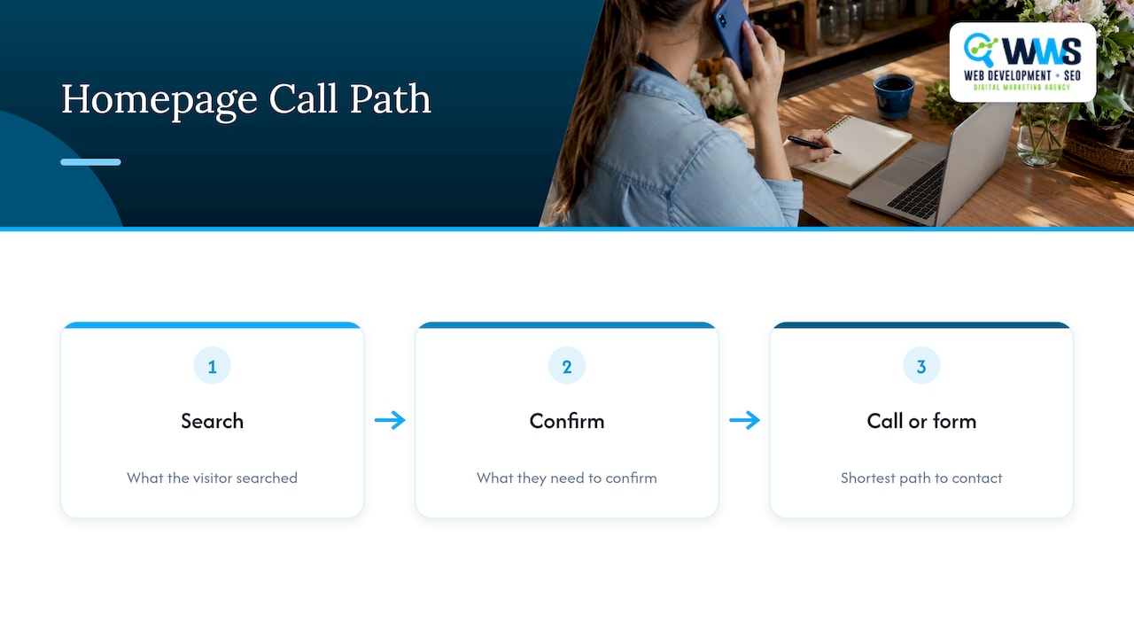
A homepage that looks sharp but hides the phone number, loads a three-megabyte hero image or names no service areas will not turn visibility into calls. In the same way, a homepage that ranks but says nothing specific will lose visitors to the next listing in the map pack. So we plan the page from the call backwards: what the visitor searched, what they need to confirm, and the shortest path to a phone call or form.
We also push clients to stop asking the homepage to do everything. Give the homepage a clear job, give each service its own page, and give each campaign its own landing page. That structure keeps messages sharp and makes it easier to measure what produces leads.
— Online Marketing Experts
Want a homepage built around calls?
If your homepage looks fine but the phone is quiet, the cause is usually in the first screen, the speed or the missing service-area signals described above. Our website design service covers design, development and hosting for local businesses in Des Plaines and the greater Chicago area, and we pair it with local SEO so the page can be found as well as used. You can also read about turning visitors into leads.
Homepage conversion checklist
Run this on your phone first, then on a desktop.
First screen
- [ ] The headline names the service and the place.
- [ ] One primary call to action is obvious.
- [ ] The phone number is tappable and visible.
- [ ] A real photo of your work or team is shown.
Content
- [ ] Main services link to their own pages.
- [ ] Reviews and proof are specific and placed near a call to action.
- [ ] Service areas are named in text.
- [ ] A closing call to action repeats the main action.
Technical
- [ ] LCP is 2.5 seconds or less, INP 200 milliseconds or less, CLS 0.1 or less in real-user data.
- [ ] The main content is not lazy-loaded or hidden behind clicks.
- [ ] Mobile content matches desktop content.
Accessibility
- [ ] You can use the whole page with a keyboard and see where focus is.
- [ ] Text resizes to 200% without breaking.
- [ ] Tap targets are large enough for thumbs.
FAQ
What is the difference between a homepage and a landing page?
A homepage introduces your business and routes visitors to the right pages, so it carries full navigation and a broad message. A landing page is built for one campaign and one action, with a message matched to the ad or email that brought the visitor. Most local businesses need both.
How many calls to action should a homepage have?
One primary action, repeated in the header, first screen and closing section, plus a few quieter secondary links such as “See our work.” The goal is that a visitor never has to hunt for the main next step. On mobile, a tap-to-call button usually works best for service businesses.
Do Core Web Vitals affect rankings?
Google says it recommends site owners achieve good Core Web Vitals for success with Search, but also that they are one part of overall page experience. Treat them as a quality baseline for visitors, not a trick for ranking.
Should my homepage list every service and suburb?
No. List your main services and core service areas, then link to dedicated pages for the details. Dedicated pages rank better for specific searches and keep the homepage readable.
Sources
- 113 Design Guidelines for Homepage Usability, Nielsen Norman Group
- How the Core Web Vitals metrics thresholds were defined, web.dev
- Core Web Vitals report, Search Console Help
- Nuvemshop image prioritization case study, web.dev
- Optimize Largest Contentful Paint, web.dev
- Page experience, Google Search Central
- Mobile-first indexing best practices, Google Search Central
- Understanding Core Web Vitals and Google search results
- Visual Designer Responsibilities, W3C WAI
Recommended
A Des Plaines, IL team helping local service businesses get found, get called and get booked since 2005: local SEO, Google Ads, conversion-focused websites and AI search optimization.
Meet the teamKeep reading
All articles
Small Business Web Page Design 101: From Blank Screen to Beautiful Site
Learn small business web page design from blank screen to launch: mobile-first layouts, conversion tips, SEO, costs, and timelines for 2026.

Small Business App Cost: What to Budget in 2026
What a small business should budget for an app: build, store fees, maintenance at 15-20% a year, and how features change the price, plus how to scope it.
Mobile Friendly Dental Website Design for Modern Practices
Discover how a mobile friendly dental website boosts patient bookings, local SEO, and trust—expert design tips from WWS Chicago.